Building animated explainers for lecture videos with Claude
Part 1 of 1 in the series AI and Education
You don’t need 3D software, animation skills or any coding experience to build animated explainers for your teaching videos. Over the past few weeks I’ve been working with Claude (Opus 5.5) to make 2D and 3D animated cutaways for LSE100’s lecture videos, and in this post I’ll show you some of the results, suggest where the technique could be useful across academic work, and explain exactly how to do it yourself.
LSE100 uses a flipped classroom format, in which students watch short video interviews with leading academics from across the School in preparation for their seminars. I have been filming and editing these videos for the past ten years, and in that time I’ve developed many ways of creating visual cutaways that help to explain key concepts, define terms or simply provide visual interest for students. But some ideas have a shape that a static graphic struggles to capture: a layered model, a cycle that sustains itself, a distinction between two ways of thinking. Those are the moments where animation comes into its own.
The idea
My colleague Steven Williams, AI and Education Specialist in LSE’s Eden Centre, showed me some examples of 3D model explainers he had created with the latest Claude models. They really inspired me, and I wanted to see whether the same approach could work for the cutaways in our videos.
The process I settled on is simple:
- Generate a transcript of the video, with timestamps.
- Give the transcript to Claude. As Steven pointed out to me, this is an area where Claude’s capabilities seem to have taken a real step forward quite recently: Opus 5.5 does this work really well, whereas earlier models couldn’t really manage it.
- Discuss where I want cutaways, going back and forth with Claude about what it could build that would genuinely help students.
- Give it the visual palette to work from (for me, LSE red and the Roboto typeface).
- Build a clip, review it and iterate.
Once you’ve done this for one video, there’s a useful final step: ask Claude to write up everything you settled on as a style guide. For every video after the first, I started a new conversation with the transcript and the style guide together, so the look and the ground rules were in place from the start.
What the explainers do
We’ve so far built clips for three sets of videos: an introduction to world orders for a seminar in the ‘How can we create a fair society?’ theme, an introduction to systems thinking, and videos for a seminar on AI in warfare for the ‘How can we control AI?’ theme. Rather than walk through all of them, here are five that show the different jobs an animated explainer can do for students.
Presenting a model in full
In our introduction to systems thinking, Dr Savvas Verdis describes the iceberg model: every system has four layers, with events and patterns visible above the waterline, and structures and mindsets hidden beneath it. The model is a visual metaphor, but on camera it exists only in words. The animation presents the model in full and makes the metaphor literal. A 3D iceberg rises against a dark background, and the camera descends past the waterline as he moves from the visible layers to the hidden ones. Each layer gains its own visual signature as he names it, and the deepest layer, mindsets, turns LSE red as he explains that this is what systems thinkers are most interested in.
Upgrading existing graphics
For Dr Jon Danielsson’s discussion of feedback loops in the same video, I already had a graphic built in PowerPoint: a map of risks in healthcare. Claude rebuilt it as an animated model. Health inequalities lead to economic inequality, which leads to doctor shortages, and when the final arrow closes the loop it turns red and begins to pulse, maintaining itself. A second loop, through privatisation, then joins it. A static arrow can only tell students that a loop sustains itself; the animation lets them watch it happen. We did the same for Verdis’s housing example, replacing my abstract diagram with low-poly 3D models of each actor in the housing market.
A second way into a concept
Professor Mathias Koenig-Archibugi’s introduction to world order turns on a distinction between order and global governance, which our seminar is built around. The animation gives students a different visual language for the same idea, and so a second way to learn it alongside his spoken explanation. Actors of different sizes circle on visible tracks. Each time a large actor sweeps past a small red one, the small one is shoved off its track, in the same way every time: the order is predictable, but the weakest predictably lose out. As he defines global governance, the definition builds on screen (order, plus a shared goal, plus coordination), and the actors leave their tracks to move together towards a common goal.
Following a distinction
Our AI in warfare seminar draws on interviews with Marissa Kemp and the late Professor Christopher Coker of LSE’s Department of International Relations. Kemp sets out a spectrum of autonomy in weapons systems: a human can be in the loop, on the loop, or out of it altogether. The animation gives students a clear way to follow this three-fold distinction. A cycle of four steps (detect, identify, decide, engage) runs beneath a marker showing where we are on the spectrum. In the loop, a red human figure sits on the ‘decide’ step, and each decision waits for their approval. On the loop, the figure lifts above the cycle, which now runs on its own, but steps in to halt it when needed. Out of the loop, the figure fades away and the cycle speeds up. Played on its own, the clip may feel slow, but each stage is timed to match Kemp’s narration exactly in the final video, which is one of the real benefits of building from the transcript.
We made this one in 2D rather than 3D so that each stage could also be cut as a looping GIF for the seminar’s slide deck, letting the seminar call back to the video (there’s an example further down).
Making the abstract concrete
Coker argues that machines ‘are not rational, they’re logical’, in a world ‘based on reason, not on logic’. It’s a striking line, but one I found hard to unpack, even as a philosopher, and on camera it stays theoretical. The animation adds the examples. It’s a split screen, with a black ‘Logic’ panel facing a white ‘Reason’ panel. First comes a dot-to-dot puzzle with a misprinted number: logic joins the dots in order and draws a zigzag, while reason sees the house it’s meant to make. Next, an ambulance arrives behind a car waiting at a red light: logic stays put, while reason edges over the stop line to make room but stops short of the junction. Finally, a figure carrying a rifle raises it overhead with a white flag: logic sees a weapon and keeps the label ‘Combatant’, while reason recognises a surrender.
These five are a sample. We built several others for the same videos, and the same principles applied to all of them.
Keeping the visuals honest
The most important rule in my style guide is about integrity: the visual must never make a stronger claim than the speaker does. Because Claude works from the transcript, every visual can be pegged to the speaker’s own words.
In the order clip, for example, the weakest actors stay small and red even once they’re moving together under global governance. Koenig-Archibugi says that governance adds direction and coordination; he doesn’t say it makes the order fair. Whether redesigning global governance could do that is exactly the question students tackle in the seminar, so the animation leaves it open.
Keeping to the speaker’s claims doesn’t mean the visual can never add anything. Coker makes his distinction between logic and reason in just a few seconds of the interview, so the clip adds examples that he doesn’t give himself. I think that’s appropriate, as long as the examples illustrate the point the speaker makes rather than reinterpreting it through the choice of example. Claude was open about this, telling me that its reading of the distinction (logic applies a rule to whatever matches its terms, while reason grasps what the rule is for) was an interpretation rather than something Coker spells out, so I could check the examples against what he actually says.
Claude also flagged its own doubts, leaving the decisions to me: for example, it wondered whether viewing the iceberg’s upper layers from below made them look less important than they are.
The collaboration ran in both directions. In Claude’s first version of the ambulance example, the reasonable car simply pulled over to the kerb behind the line. That broke no rule, so it didn’t actually illustrate the distinction. I pointed out that to make room, the car would have to edge over the line, breaking the letter of the rule while keeping to its point by staying out of the junction. Claude added a junction to the scene so that the difference is visible.
Where else this could work
The obvious use is any recorded teaching: lecture capture, flipped classroom videos, MOOCs and research explainers. But the underlying technique is broader than video cutaways. Claude is writing code that builds each scene from scratch, so anything you can describe as a structure, a process or a relationship can be animated.
In the social sciences, that might mean conceptual models that students usually meet as static diagrams: Ostrom’s design principles for the commons, path dependence, principal–agent relationships, or the stages of a policy cycle. In history and politics, it might mean contingency and counterfactuals, or competing normative frameworks shown side by side. In philosophy, thought experiments could be staged in space: Steven’s own example was Bentham’s Panopticon, which he built as an interactive Claude artifact that students could explore visually. The split-screen format of the logic and reason clip would suit any pair of concepts that students tend to blur: the letter and the spirit of a law, rule-following and practical wisdom, correlation and causation. My own research background is in philosophy of medicine, and I can imagine an animated evidence hierarchy that lets students see the pyramid being contested rather than simply received. In the sciences and medicine, processes such as feedback in physiology, the spread of an infection through a network, or the structure of a molecule are natural candidates.
The animations can also live beyond the video. Short looping GIFs cut from a clip can go into slide decks or onto a course page, so a seminar can call back to an idea that students first met in the video.
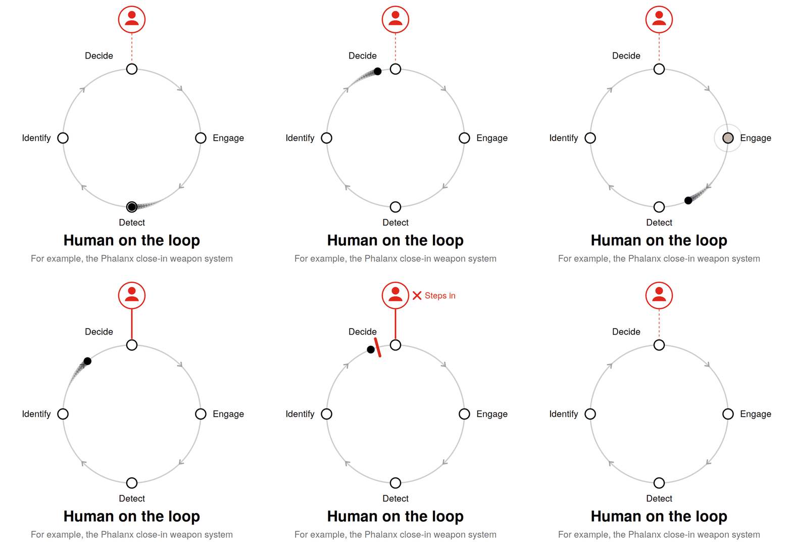
The ‘on the loop’ stage of the spectrum of autonomy clip, cut as a looping GIF for the seminar slides.
There are research uses too. A conference talk could open with a 30-second animation of a paper’s core argument, and a public engagement video could make a theoretical framework tangible. There’s also a pedagogical opportunity I’m keen to explore: students building their own system maps and then working with AI to animate them. That would require them to be precise about what causes what, which is exactly the kind of thinking we want to develop.
One caution: this technique is for conceptual and schematic visuals. Nothing in our clips shows real data, because none was given. If you want a chart that visualises real data from a source, I would be less confident in the accuracy of the visual representation.
How to do it yourself
You’ll need access to Claude with code execution and file creation turned on (this is a setting in Claude’s interface). You don’t need any 3D software or coding experience; everything happens in conversation.
It helps to know what’s happening under the hood, because there’s no dedicated 3D or video feature involved. Claude writes Python code in its code environment that builds each scene from scratch. For the 3D clips, that’s a small hand-built 3D renderer (using the PIL and numpy libraries) with a perspective camera, shaded shapes and simple low-poly models; the flat clips use a drawing library called pycairo. Each frame is rendered as an image, and a tool called ffmpeg assembles the frames into a video. No Blender, no After Effects, no specialist software.
If your explainer is for a video, start with a timestamped transcript. The transcript gives Claude the exact words and timings. Automatically generated transcripts contain errors (ours certainly did), so check names, terms and timings against the footage.
Decide how much you want to steer. If you already know what you want, simply describe it. For the systems thinking video, I knew exactly which moments needed graphics and what they should show, so I just said so. If you’re less sure, ask Claude to propose ideas. For the world order video, my opening request was essentially:
Here is the transcript of my video. Identify the moments where a visualisation would carry an idea better than speech, rank them, and give me timestamps, a proposed design and any integrity risks for each.
Ask, too, which moments it wouldn’t animate, and why. This back-and-forth is where the pedagogical thinking happens, so engage with it critically: push back, merge ideas or reject them.
Give it your visual palette. Tell Claude your colours and typeface. A single accent colour, reserved for the key idea in each clip, does a lot of work. If your institution has a brand profile with its own colour scheme, stipulate it. LSE is very keen on its particular shade of red, and Claude matched it carefully for screen. It can also fetch openly licensed fonts such as Roboto itself.
Prototype one clip, then map the beats. Building one clip first lets you judge the quality and settle the look before committing to a set. For each clip, Claude can map every visual beat to an exact timestamp: when each label appears, when the camera moves, when the accent colour arrives. Check this against your own edit, because transcript timestamps are approximate.
Review stills before the full render. A full render takes several minutes, so ask for a contact sheet of six to ten key stills first. Claude reviewed these itself for overlapping text and framing problems, and revised the design before rendering, sometimes twice. Look above all for unintended messages: does the visual claim anything stronger than the speaker does? In 3D, check the camera angle as well as the content, since perspective can change what a shape seems to say. Longer clips are rendered in sections and joined, because a single long render can time out; if Claude reaches the end of what it can do in one response mid-render, just reply ‘continue’. Afterwards, ask it to pull frames from the finished video, particularly at the joins, to check them.
Bring your own materials and ideas. Some of my best results came from uploading old PowerPoint slides and asking Claude to rebuild them. It kept every arrow faithful to my original, and asked me where it couldn’t infer something rather than guessing. Rough ideas are worth offering too. The dot-to-dot puzzle started as a half-formed suggestion of mine, and it came back better than I’d described it, with details such as the misprinted dot that I hadn’t thought of.
Think about the edit as a whole. A video made mostly of cutaways loses the speaker, who is the heart of it, so leave them on screen between clips, and end each clip just before a key line so they can deliver it to camera. If two clips in the same video or seminar deal with similar-sounding ideas, ask for them to look visibly different (a different background, structure and use of the accent colour) so that students don’t conflate them. A recurring visual element can do the opposite job, helping students connect related ideas across a course.
Ask for slide versions. Once a clip works, ask for its key stages as looping GIFs. They make a natural bridge between the video students watch beforehand and the seminar itself.
Iterate in plain language. Every change I asked for was a simple message, such as ‘remove the housing references and let the voiceover carry them’, ‘use the black background throughout’ or ‘could the car pull slightly across the line?’. You’re directing, not coding.
Turn it into a style guide. Once you’re happy with the first video, ask Claude to summarise everything you settled on as a style guide to paste into future conversations. Mine covers:
- palette, with LSE red as the single accent;
- typography, with fixed sizes and positions for titles, definitions and captions;
- a visual vocabulary, such as spheres for abstract actors and glass shells for boundaries;
- motion: smooth easing, slow camera movements, and a one-second hold at the end of each clip as an edit handle;
- technical output: 1920×1080 at 25 frames per second, as an MP4;
- the integrity rule: the visual must never make a stronger claim than the speaker does.
There are a few limitations. Claude works from the transcript rather than watching your edited video, so your eye on the final edit is essential. Renders take real time, sometimes ten or fifteen minutes for a pair of longer clips. The integrity judgements are a collaboration: Claude is good at flagging where a visual might overclaim, but you know your speakers and your students, and the final call is yours.
Although I’m delighted with the results, the polish of the output isn’t really the point. Building a good explainer forces you to be exact about what an idea’s structure actually is, and what the speaker is and isn’t claiming. That’s a discipline worth bringing to all our teaching materials, with or without AI.